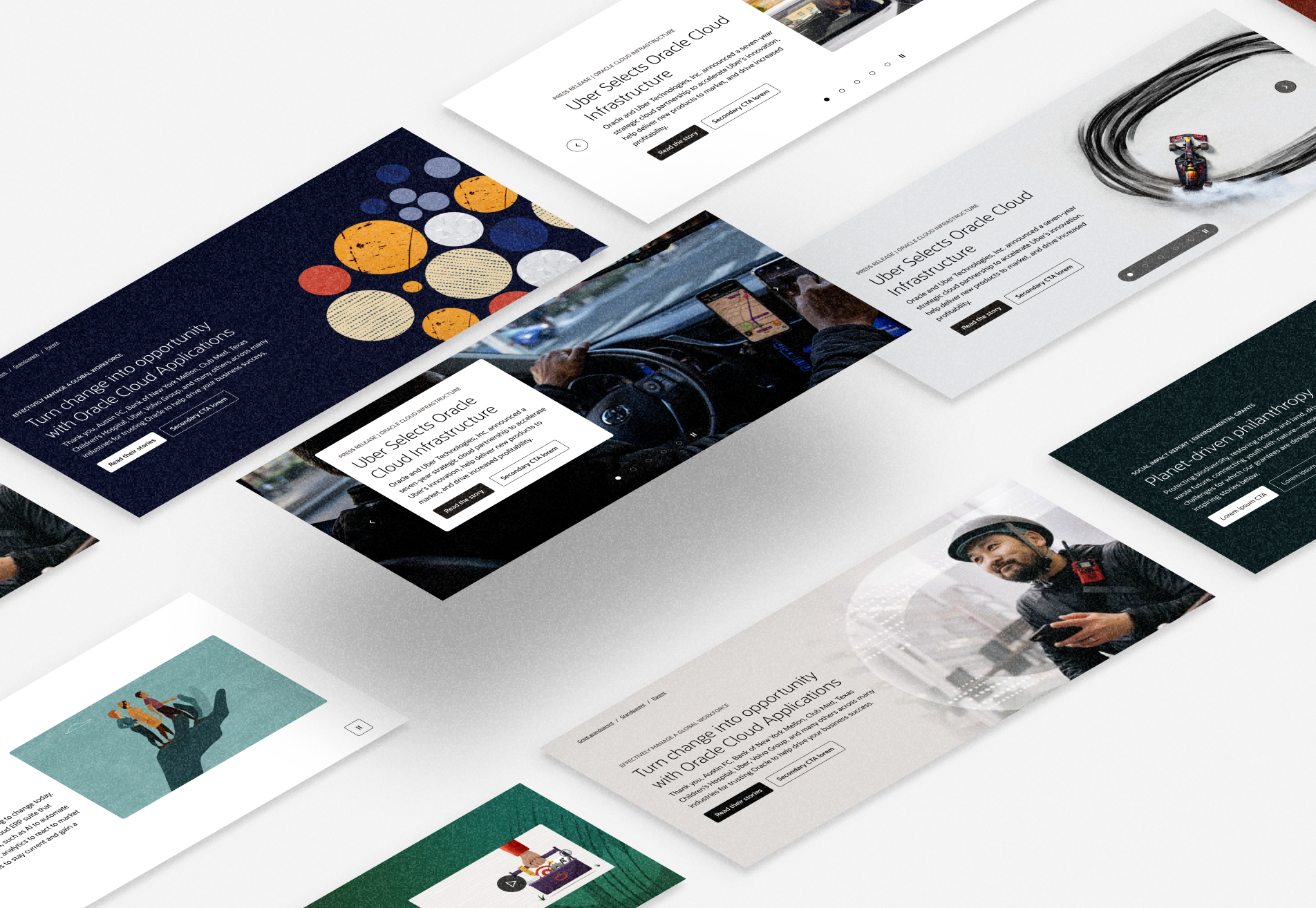
Sequoia Design System and codebase
Creating a future proof design system for Oracle.com
Blackrock
How can we help institutional investors discover and evaluate all of their options?
The challenge
Beta strategy investors pick an index and an investment instrument that tracks its returns as closely as possible. What if they could explore the complete universe of instruments to find the best performance with the lowest cost with the lowest amount of risk?
The process
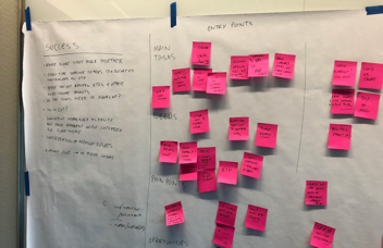
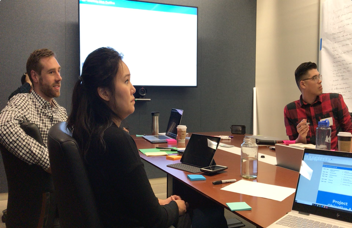
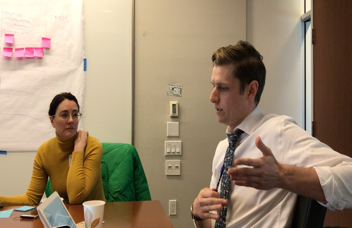
I sat down with beta strategy institutional investors and mapped out their whole process, identified pain points and opportunities. I presented concepts, refined them until we landed on a solution. From there I worked in agile sprints to design, validate, and iterate in fast two week cycles.
Getting started
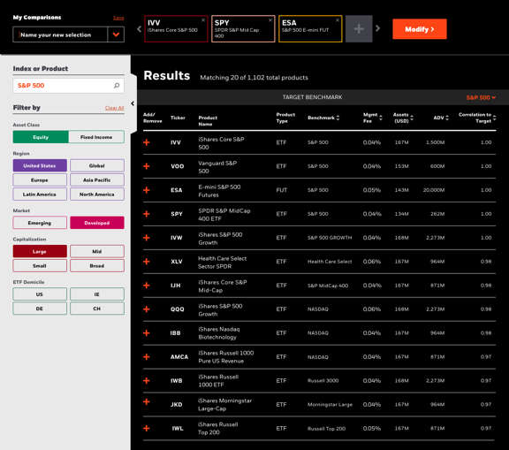
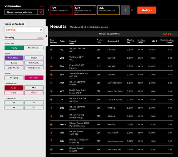
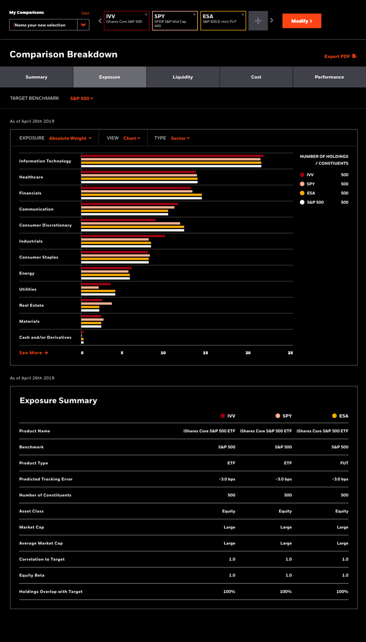
Users can narrow their field of view by selecting a target index or filtering by exposure. Afterwards they can add their top instruments to compare.
Getting granular
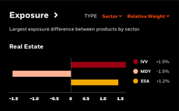
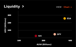
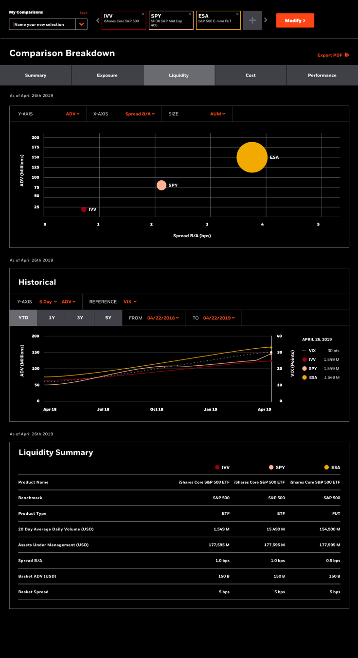
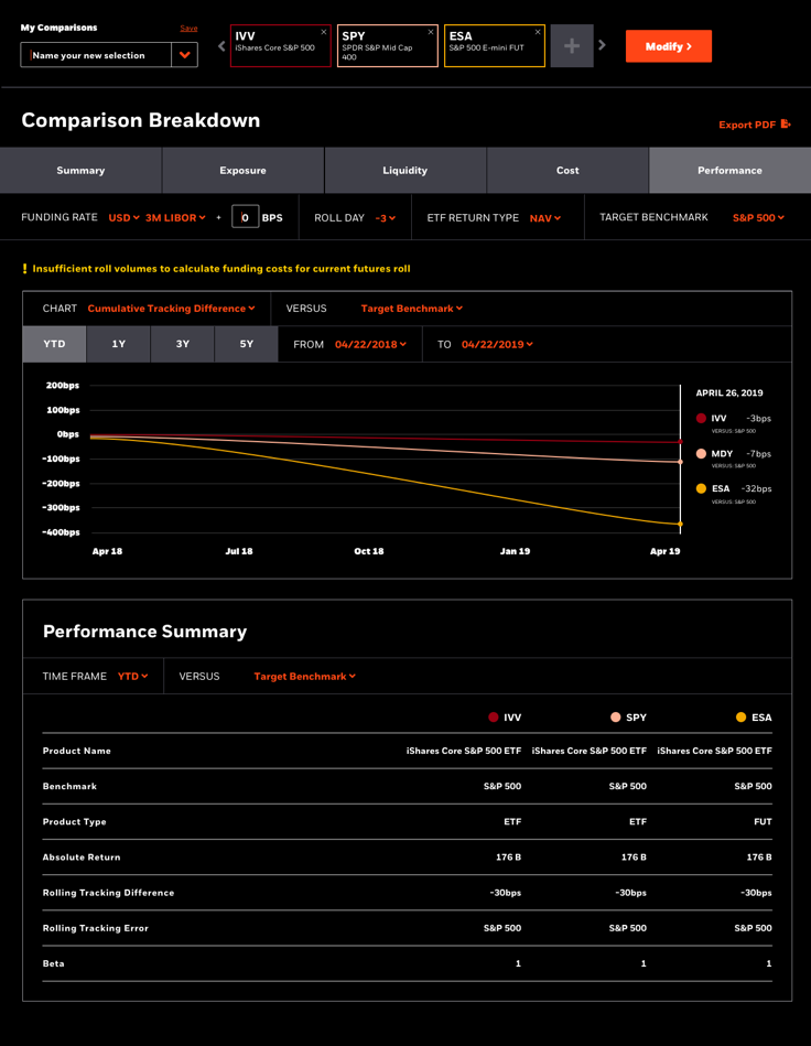
ETFs and Futures are hard to compare for a reason. Many of their metrics aren’t one for one. It’s important to use the right lenses to evaluate them. The result is a high level view that also works at ground level.

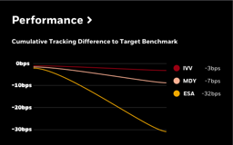
The results
By consolidating the complete universe of investment vehicles into one tool I was able to provide a comprehensive comparison experience that simplifies the search and evaluation process.


Creating a future proof design system for Oracle.com
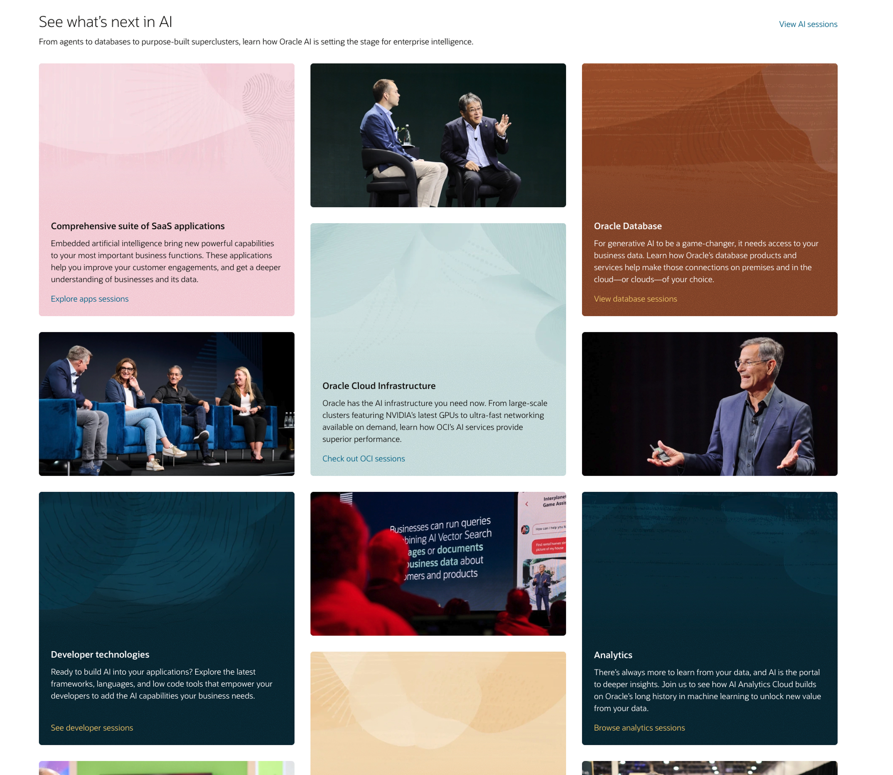
Creating a site to drive registrations and engagement
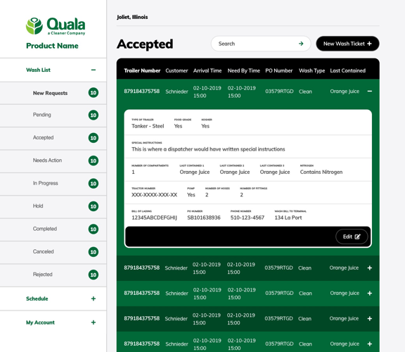
Digital transformation on a deadline. 90 days to deliver a product that transforms a business.
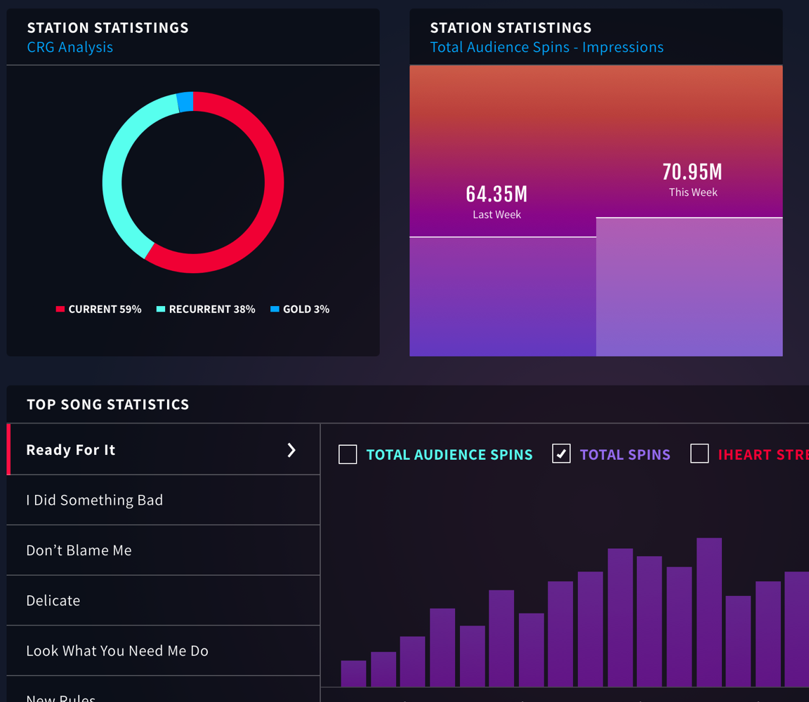
Redefining radio in the age of big data, leveraging listener feedback into smart playlists.